

Your checkout page is the most critical stage in your ecommerce store's sales funnel. Small design tweaks here can be the difference between a significant boost in sales and a disappointing drop-off in customers. This final step, where a user finalizes their purchase, must be smooth, secure, and effortless. Optimizing your checkout process is not just about aesthetics; it's a direct strategy to increase your conversion rate, reduce abandoned carts, and foster customer loyalty from the very first transaction.
A checkout page is the final destination in an online shopper's journey. It's the virtual equivalent of a physical store's sales counter, where customers provide their shipping information, select a payment method, and complete their transaction. This page gathers all the necessary details to process an order, including the customer's name, address, and payment information. For any ecommerce business, this is where a potential sale becomes a confirmed one.If you're looking for visual examples of checkout page designs for reference, you can explore design inspiration websites such as Dribbble and Behance, or search for 'checkout page design examples' on Google Images and Pinterest. Many ecommerce platforms' blogs and resources also showcase sample checkout pages to help guide your design choices.
The design and functionality of the checkout page are crucial for a positive checkout experience. It's the last interaction a customer has with your brand before their purchase is complete, making it a pivotal moment. A well-designed page streamlines the purchase process, instills confidence, and minimizes friction, ensuring the customer moves from adding items to their cart to finalizing the order without hesitation. The goal is to make this final step as simple and secure as possible.

The importance of a well-optimized checkout page for your ecommerce store cannot be overstated. It directly impacts your conversion rate and is your last chance to prevent cart abandonment. A confusing or lengthy process can frustrate users, causing them to leave without completing their purchase, even if they were ready to buy. Let's explore the specific ways a great checkout page benefits your business.
A primary function of an optimized checkout page is to maximize your conversion rate. Every element, from the layout to the number of form fields, contributes to the number of visitors who complete their purchase. A streamlined checkout flow reduces friction and guides the customer toward the final "buy" button with minimal effort.
Popular brands achieve higher conversion rates by implementing best practices that enhance the user experience. They often use a minimalist design to remove distractions, ensuring the customer's focus remains solely on completing the transaction. This includes removing the main site navigation, sidebars, and promotional pop-ups that could tempt a user to click away.
By simplifying the journey and making each step clear and intuitive, you create a path of least resistance. This focus on a seamless user experience is a hallmark of successful brands, which understand that a frictionless checkout translates directly into more completed sales and higher revenue.
High cart abandonment rates often signal a problem within your checkout process. Studies show that a significant percentage of shoppers abandon their carts due to unexpected costs, a complicated user experience, or being forced to create an account. A well-designed checkout addresses these issues head-on.
Features that help reduce cart abandonment include offering a guest checkout option, which eliminates the friction of mandatory account creation. Displaying all costs upfront, including shipping and taxes, builds trust and prevents last-minute surprises that scare customers away. Furthermore, a progress indicator can manage expectations by showing customers exactly where they are in the entire checkout process.
By anticipating and solving these common pain points, you can significantly lower your cart abandonment rate. The goal is to make the entire checkout process feel transparent, secure, and effortless, giving customers every reason to complete their purchase.
Customer trust is paramount during the checkout experience, especially when users are asked to share sensitive payment information. A checkout page must visually communicate that the transaction is secure and the user's data is protected. This is achieved through the strategic use of trust signals.
Design elements that build customer trust include displaying security badges (e.g., the padlock icon), logos of accepted payment methods (e.g., Visa, PayPal), and money-back guarantees. These visual cues serve as powerful reassurances, alleviating concerns about payment security. A professional, clean design also contributes to a feeling of legitimacy and reliability.
When customers feel confident that their payment information is safe, they are far more likely to complete their purchase. Building and maintaining customer trust at this final stage is not just a best practice; it's essential for converting shoppers and fostering long-term loyalty.
In today's fast-paced digital world, customers expect a quick and seamless purchasing experience. A slow or cumbersome checkout process can lead to frustration and abandonment. Your goal should be to get the customer from cart to confirmation as efficiently as possible, which directly impacts completion rates.
The debate between one-page and multi-page checkouts centers on this user experience. A one-page checkout, often using an accordion-style design, presents all necessary fields on a single screen. This can feel faster as customers can see the entire process at a glance. However, it can also appear overwhelming if not designed carefully.
Conversely, a multi-page checkout breaks the process into smaller, more manageable steps (e.g., Shipping, Billing, Review). This can reduce cognitive load but may feel lonely without a clear progress bar. The best choice depends on your specific needs, but both formats must prioritize a smooth checkout flow to maximize completion rates.
Also Read: How a Premier Portuguese Winery Cultivated a +16.80% AOV Lift.

A high-converting checkout page is built on a foundation of best practices designed to optimize every aspect of the user's journey. Essential elements include streamlined forms, visible trust signals, a variety of payment options, and a clear order summary. Integrating these features effectively can dramatically improve your conversion rate. Below, we'll examine these crucial components in more detail.
One of the quickest ways to lose a customer is by presenting them with a long, intimidating checkout form. Streamlining form fields is a critical best practice for a successful checkout. Only ask for the essential information needed to process the order. Every extra field you add increases the chance of abandonment.
Leveraging technology like autofill support significantly enhances the user experience. When a browser can automatically populate address fields and other shipping information, it saves the customer time and reduces typing errors, especially on mobile devices. Address lookup services, which suggest addresses as the user types, further simplify this step.
Successful checkout pages follow these design best practices:
Building a sense of security is non-negotiable on a checkout page. Customers are handing over sensitive payment information, and they need to feel confident that their data is protected. Trust signals are visual cues that provide this crucial reassurance.
Prominently displaying trust badges and security indicators is an effective way to communicate safety. These elements serve as a third-party endorsement of your site's security measures. Including a clear privacy assurance statement also helps, letting customers know how their personal data will be handled.
Effective design elements for building trust include:
Not all customers want to pay the same way. A lack of preferred payment methods is a common reason for cart abandonment. Offering a variety of payment options caters to different customer preferences and increases the likelihood of a successful transaction. Beyond the standard credit card input, integrating digital wallets such as Google Pay, Apple Pay, and Shop Pay provides an alternative checkout option. These options allow customers to complete their orders with just a few clicks, bypassing the need to enter shipping and payment details manually. "Buy Now, Pay Later" services like Klarna or Afterpay also add flexibility for customers making larger purchases.
Providing multiple payment options is a standard feature in most optimized checkout templates and layouts. Key methods to include are:
Forcing customers to create an account before they can make a purchase is one of the biggest conversion killers. Many shoppers, especially first-time buyers, see mandatory account creation as a barrier. A guest checkout option removes this friction, allowing them to proceed directly to payment.
Offering guest checkout significantly improves the customer experience and can lead to a substantial increase in conversion rates. It caters to users who prioritize speed and convenience. You can always provide the option to create an account after the purchase is complete, which is a much less intrusive approach. This way, you capture the sale first and then focus on building a long-term relationship.
Key approaches to account creation include:
Also Read: How Lifetime Technologies went from a Single Additive to System Kits.
Theory is helpful, but seeing real-world examples is where the best lessons are learned. Many ecommerce stores have perfected their checkout design by focusing on speed, trust, and a frictionless user experience. The examples below will provide practical inspiration and demonstrate how different design choices and features can be combined to create a powerful, sales-boosting checkout flow.

Source: Casper
Casper effectively uses several key features on its checkout page to build trust and improve the customer experience. The page highlights key trust signals, such as a risk-free trial and free, no-contact delivery, that help reassure customers in the final stage of their purchase decision. Casper also includes a subtle upsell in the delivery section, offering bed construction services and allowing customers to conveniently add extra services. In addition, the checkout page follows a clean and minimalist design that keeps the focus on completing the purchase quickly and smoothly.
The layout minimizes distractions and presents only the most essential information needed to finalize the order. Clear payment options and a simple checkout flow make the purchasing process easier for customers. By combining express checkout options with trust-building elements, Casper ensures a fast, reliable, and user-friendly checkout experience.

Source: PupSocks
PupSocks demonstrates that a checkout page can include multiple engagement elements without feeling cluttered. Their approach proves that a "maximalist" design can be effective when every element serves a clear conversion-focused purpose. The page is rich with information but remains easy to navigate.
They successfully integrate social proof by making customer reviews visible in the process, which helps build confidence among new buyers. Furthermore, PupSocks highlights express shipping options for customers who need their items quickly and includes a free incentive to increase the perceived value of the order. This balanced approach keeps the user experience engaging.
By carefully curating each element, PupSocks ensures nothing distracts from the core goal of completing the purchase. Their checkout is a great visual example of how to balance rich content, such as product details and reviews, with a smooth checkout flow.

Source: Yamazaki
Yamazaki, a home goods retailer, offers a feature-rich checkout page while maintaining a streamlined design. Their checkout flow demonstrates how to incorporate multiple conversion-boosting elements in harmony without creating visual chaos or overwhelming the customer.
At the top of the page, a progress indicator keeps customers inform their position in the checkout flow. Express checkout options are prominently displayed for quick payment, while the order summary clearly shows any applied savings next to the total amount. This transparency in the order summary is key to building trust.
This checkout design is effective because it uses a strong visual hierarchy. While multiple features are present, the most critical information—shipping and payment details—remains the primary focus. This ensures the page is helpful without being distracting, guiding the customer smoothly to complete the purchase.

Source: PALM
PALM, a handcrafted jewellery brand, excels at maintaining brand consistency throughout the entire checkout experience. The design of their checkout page aligns perfectly with their premium brand aesthetic, ensuring the customer's journey feels cohesive from browsing to buying. This consistency is a design element that reinforces the quality and value of their products.
The page is also a masterclass in value communication. It prominently highlights free shipping and provides transparent estimated delivery dates, which helps manage customer expectations and justifies the order value. This level of transparency is crucial for building trust, especially for a brand selling premium goods online.
By ensuring the checkout's design quality matches the product quality, PALM makes a powerful statement. Customers judge a product's value based on their entire digital experience, and a polished checkout page like PALM's reinforces their decision to purchase.

Source: Ridge
Ridge, a brand known for its minimalist wallets and accessories, showcases an innovative approach to capturing contact information. Instead of just using form fields to collect an email address or phone number for order updates, they use the checkout as an opportunity to build a future marketing relationship without being intrusive.
Their checkout page includes an optional invitation for customers to join an SMS list for exclusive offers. The value proposition is clear: share your contact information to get access to special deals. This approach is effective because it is positioned as a benefit to the customer rather than a requirement for purchase.
By making this engagement optional, Ridge respects the customer's choice while still successfully building a marketing channel. This real example demonstrates how to think beyond the immediate transaction and use the checkout page to create long-term value and customer relationships.
Also Read: How to Enhance Your Post Purchase Experience for Loyalty?

Source: Duradry
Duradry, a personal care brand, effectively uses psychological triggers to lower its cart abandonment rate and encourage immediate action. Their checkout flow strategically integrates urgency and social proof to build confidence and motivate customers to complete their purchases without hesitation.
One of the key features they use is a countdown timer for limited-time offers, which creates a sense of urgency. This is paired with social proof elements, such as customer reviews and testimonials, which are visible directly on the checkout page. This combination reassures hesitant buyers by showing that others have purchased the product and are happy with it.
These elements, when used authentically, can be powerful tools for reducing cart abandonment. By creating a feeling that the customer might miss out on a great deal, Duradry nudges them toward completing their order, making their checkout flow a great example of psychology in action.

Source: Cure Mushrooms
Cure Mushrooms, a health supplement brand, demonstrates how popular brands design their checkout pages to remove common points of friction. One of their standout features is a highly optimized process for applying a discount code, which is a frequent source of frustration for shoppers.
Their checkout process features a prominently visible field for entering promotional codes. The application process is simple and intuitive, providing immediate visual feedback in the cart summary when a discount is successfully applied. The order value updates in real-time, showing the customer exactly how much they've saved.
This seamless experience is crucial because customers with a discount code expect to use it easily. Any difficulty in this step can lead to frustration and abandonment. By making the process effortless, Cure Mushrooms ensures that a positive incentive doesn't accidentally become a negative experience.
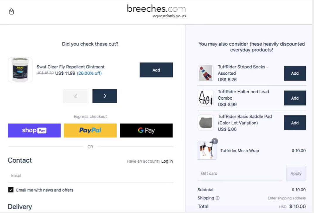
Source: Breeches
Breeches, an equestrian equipment retailer, has mastered the art of the strategic product upsell to increase average order value (AOV). Their checkout page intelligently recommends complementary products that genuinely enhance the customer's primary purchase, rather than just pushing more expensive items.
For example, a customer buying a horse's mesh fly trap might see a recommendation for a discounted fly repellent ointment. This type of logical pairing solves an additional problem for the customer, making the upsell feel helpful instead of pushy. The order summary clearly displays the product details of all items, maintaining transparency.
This approach shows how popular brands use checkout page design to increase conversions and revenue. By focusing on value-added recommendations, Breeches effectively boosts its AOV without disrupting the customer's journey, turning the checkout into a final opportunity to serve the customer better.

Source: Ana Hana Flower
Ana Hana Flower, a floral and gift retailer, provides a perfect example of a two-column layout executed with excellence. This is best practice: it's highly effective for organizing information intuitively and reducing customers' cognitive load during the final stages of a purchase.
The layout cleanly separates the checkout form, where customers enter their address and payment details, from the order summary. On one side, customers can focus on filling out their information without distraction. On the other hand, they have a constant, clear view of their shopping cart contents, delivery options, and total cost.
This logical separation of information is a hallmark of a well-designed checkout. It allows customers to process different types of information in distinct visual blocks, making the entire page feel less cluttered and easier to navigate. Ana Hana Flower's checkout is a great reference for how to structure information for maximum clarity.
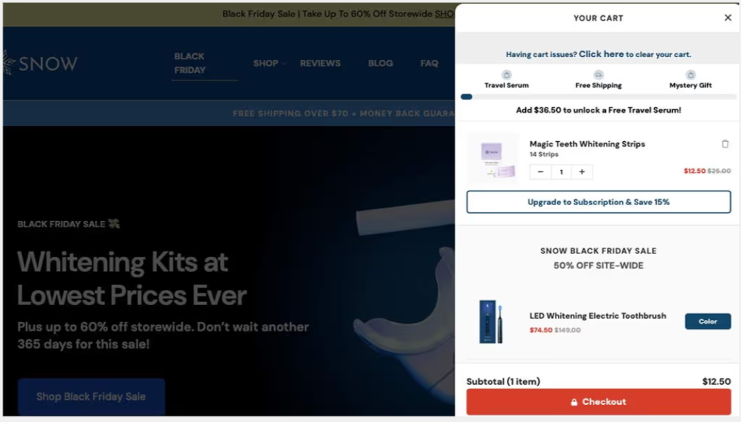
Source: Snow
Snow, a dental care brand, showcases cross-selling mastery within its checkout flow. They demonstrate how popular brands design their pages to increase average order value through intelligent, relevant product suggestions that feel like a natural part of the checkout process.
Their strategy focuses on recommending additional products that complement the main purchase. For example, a customer buying a teeth whitening kit might see a product upsell for a whitening-friendly toothpaste. The benefits of the add-on product are clearly communicated, and it can be added to the cart summary with a single click.
This approach is effective because the suggestions are logical and provide genuine value to the customer. Instead of disrupting the checkout flow, these recommendations enhance it by helping the customer get the most out of their primary purchase. Snow's checkout page serves as a prime example of how to integrate cross-selling seamlessly.
Also Read: How to Master Post Purchase Behavior to Retain Customers?

While implementing best practices is crucial, it's equally important to be aware of checkout design mistakes that can cripple your conversion rates. Avoiding these pitfalls is just as critical as adopting positive features. Understanding what not to do can help you refine your checkout page into a streamlined, trustworthy, and effective sales tool. Let's look at some of the most frequent errors that ecommerce stores make.
A complicated and lengthy checkout process is a primary driver of cart abandonment. When customers are faced with too many steps or an overwhelming number of form fields, they are likely to give up before completing their purchase. Simplicity and speed are essential for high completion rates.
Every additional step in your checkout flow is another opportunity for a customer to leave. Reducing the number of pages, clicks, and fields required to complete a purchase is one of the most effective ways to reduce cart abandonment. The goal is to create a path of least resistance from the shopping cart to the confirmation page.
To avoid this mistake, focus on streamlining your checkout process:
In an era of digital wallets and diverse financial technologies, limiting your payment options is a significant mistake. Customers have their preferred payment methods, and if they don't see their favorite option available, they may abandon their cart in search of a competitor who offers it.
Failing to offer popular payment methods like PayPal, Google Pay, or Apple Pay can alienate a large portion of your potential customers, especially mobile shoppers who rely on these for quick transactions. Simply offering a standard credit card form is no longer enough to meet modern consumer expectations.
Most modern checkout templates and layouts are designed to accommodate a wide range of payment options. To avoid this error, ensure your checkout supports a variety of payment methods. This flexibility caters to broader customer preferences and builds trust by associating your brand with established payment providers.
One of the most common and damaging mistakes in checkout design is surprising customers with hidden fees and unexpected costs at the final step. When a shopper sees a total in the order summary that is significantly higher than they anticipated, it breaks trust and is a leading cause of cart abandonment.
Transparency is crucial. All costs, especially shipping costs and taxes, should be communicated as early and clearly as possible. Many high-converting checkouts provide a shipping calculator on the cart page or display estimated costs upfront. This prevents sticker shock and allows the customer to make an informed decision.
To avoid this critical mistake, prioritize transparency:
Forcing potential customers to create an account before they can complete a purchase is a major roadblock. This requirement adds friction to the checkout process and can deter shoppers who are in a hurry or are not yet ready to commit to a long-term relationship with your brand.
A guest checkout option is a simple yet powerful solution that can significantly boost conversion rates. It allows customers to proceed directly to payment without the hassle of creating a password and filling out extra registration forms. This frictionless experience is particularly appealing to first-time buyers.
By making account creation mandatory, you risk losing a substantial number of sales. The best practice is to offer a guest checkout option as the primary path and provide an opportunity for customers to create an account after checkout. This respects the customer's time and priorities.
Also Read: How Calitron Boosted Revenue and AOV with Smart Bundling.
While the primary goal of a checkout page is to complete the sale, it also presents a valuable opportunity to increase the average order value (AOV). Popular brands often design their checkout pages to include strategic product upsell offers that enhance the customer's purchase. You can achieve this on your ecommerce site with a tool like the Kefi Product Bundle Builder.
By integrating Kefi with your checkout experience, you can present customers with relevant product bundles or add-ons just before they finalize their payment. For example, you could offer a discounted care kit for a product already in their cart or suggest a popular bundle that provides more value. This turns a standard transaction into a dynamic selling opportunity, increasing the final order value while providing customers with useful, complementary products.
Book a Demo to see how Kefi Product Bundle Builder works.
A well-optimized checkout page is crucial for enhancing customer experience and driving conversions. By incorporating features such as streamlined forms, trust indicators, and flexible payment options, you can significantly reduce cart abandonment and foster a sense of security among your customers. The best examples outlined in this blog illustrate how innovative design elements can create a seamless purchasing journey that resonates with users. Avoiding common pitfalls, like unexpected fees and complicated processes, will ensure that your checkout page not only attracts visitors but also converts them into loyal customers. Ready to elevate your sales? Get a free trial of our Kefi Product Bundle Builder and transform your checkout experience today!
Checkout page examples from successful ecommerce stores usually focus on simplicity, clear order summaries, and minimal form fields. These pages are designed to help customers complete purchases quickly while reducing friction during the final stage of the buying process.
Checkout page design examples highlight best practices such as clean layouts, visible payment options, and trust badges. Studying these designs helps businesses understand how to create a user-friendly checkout experience that improves conversions.
Checkout optimization news can be found on ecommerce blogs, industry publications, and platform updates from major ecommerce providers. These sources share new strategies, design trends, and technology improvements that help merchants enhance their checkout performance.
One-page checkout examples show how all checkout steps, such as shipping details, payment information, and order review, are combined on a single page. This streamlined process reduces the number of steps required and can significantly improve checkout completion rates.
A Shopify checkout page example usually includes customer information fields, shipping options, payment methods, and a clear order summary. The layout is optimized for both desktop and mobile devices to ensure a smooth and secure checkout experience.
Single-page checkout examples demonstrate how simplifying the checkout flow can reduce friction for shoppers. By allowing customers to complete all required steps on a single page, stores can shorten the purchasing process and reduce cart abandonment rates.
A sample checkout page demonstrates how the final purchase step in an ecommerce store is structured. It typically includes customer information fields, shipping details, payment options, and an order summary to help shoppers review and complete their purchase smoothly.
The best checkout page design examples typically include a clean interface, progress indicators, guest checkout options, and multiple secure payment methods. These elements help build customer trust and encourage faster purchase completion.
Successful ecommerce checkout page design examples focus on clarity, speed, and ease of use. They minimize distractions, display clear pricing details, and ensure that customers can complete their purchase with as few steps as possible.