A Slide Cart turns a simple cart into a powerful conversion tool.
Instead of redirecting shoppers to a separate cart page, it slides in instantly—keeping them engaged and focused on checkout without breaking their browsing flow.
With Kefi’s Slide Cart, the cart becomes an interactive sales channel. You can showcase products, highlight upsells, unlock rewards with progress bars, trigger free gifts, and display discounts—all in one smooth experience.
This not only makes shopping easier but also drives higher order values, builds trust, and reduces cart abandonment.
A Slide Cart isn’t just a design upgrade—it’s a powerful conversion tool that improves both the shopping experience and your store’s performance.
Set up the Slide Cart
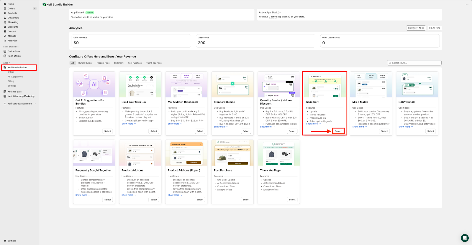
Go to the Kefi Bundle Builder Homepage and choose the ‘Slide Cart’ option. Click ‘Select’.
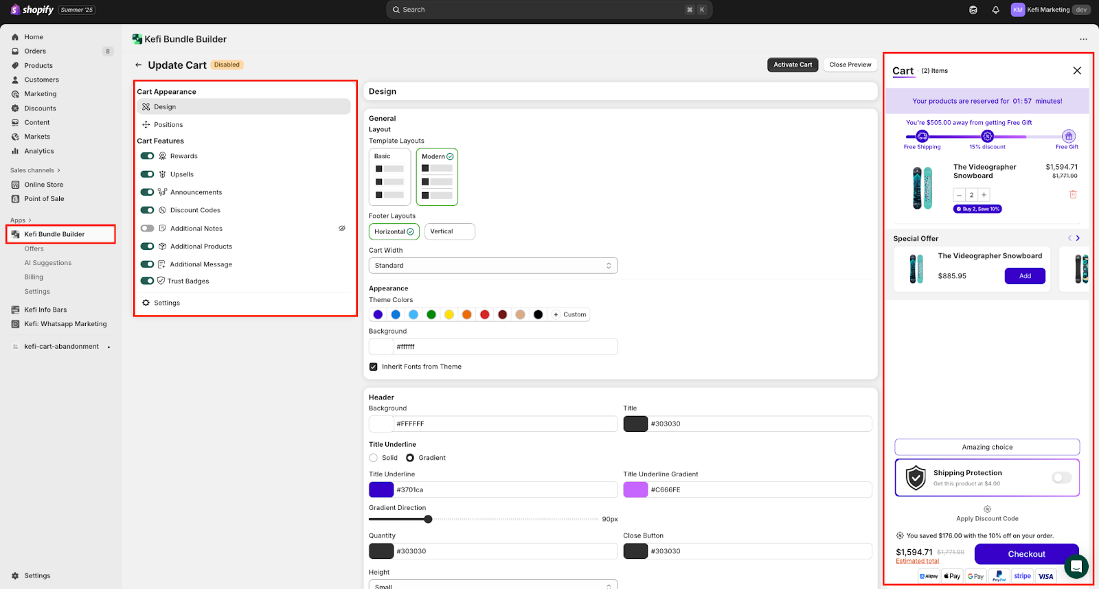
On the redirected page, in the left panel, you’ll find all the key customization options — including Cart Appearance, Cart Features and Settings. Each section lets you fine-tune how your cart looks and behaves.
On the right side, the live preview updates instantly, so you can see exactly how your cart will appear to customers as you make changes.
Work on the Cart Appearance.
1. Design - Customize the visual layout of your cart, including background color, font style, cart width, button styling, and border radius — ensuring it blends seamlessly with your store's branding.

Key Customization Options:
1. General - The Design tab under Cart Appearance lets you fully personalize how your slide cart looks, helping it blend seamlessly with your store’s brand and theme.
A. Template Layouts - Choose from two layout styles, and select the one that fits your store's aesthetic best.:
Basic – Clean and straightforward, with simple stacking of cart elements.
Modern – A more structured, visually dynamic layout.
B. Footer Layouts - Choose from Horizontal or Vertical Layouts.
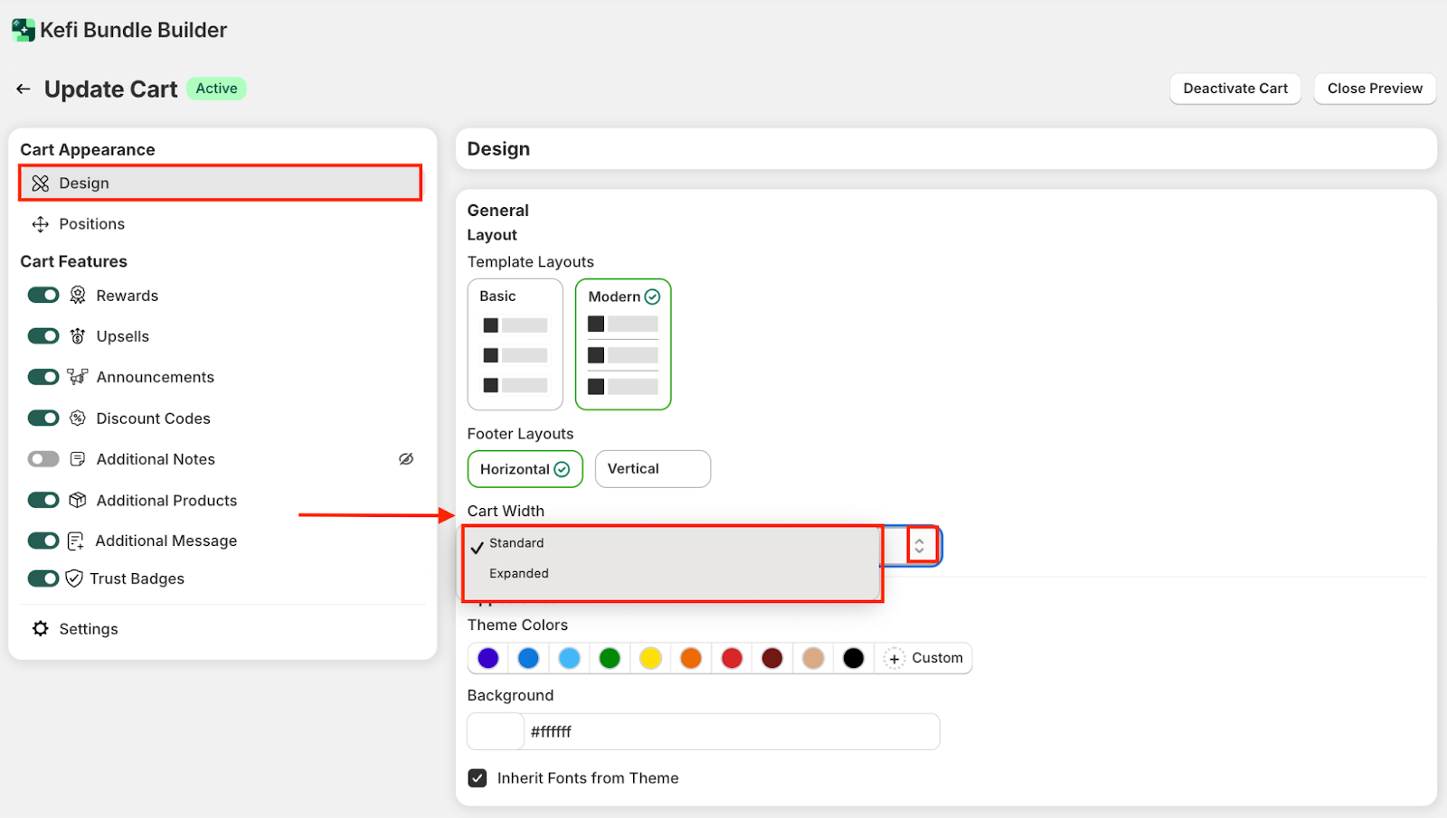
C. Cart Width - Choose between different Cart Widths (e.g., Standard, Expanded) to control how much space the cart panel occupies on screen.
D. Theme Colors - Pick a primary color theme for your cart interface using preset color swatches. Or, click Custom to define your own hex or brand-specific colors.
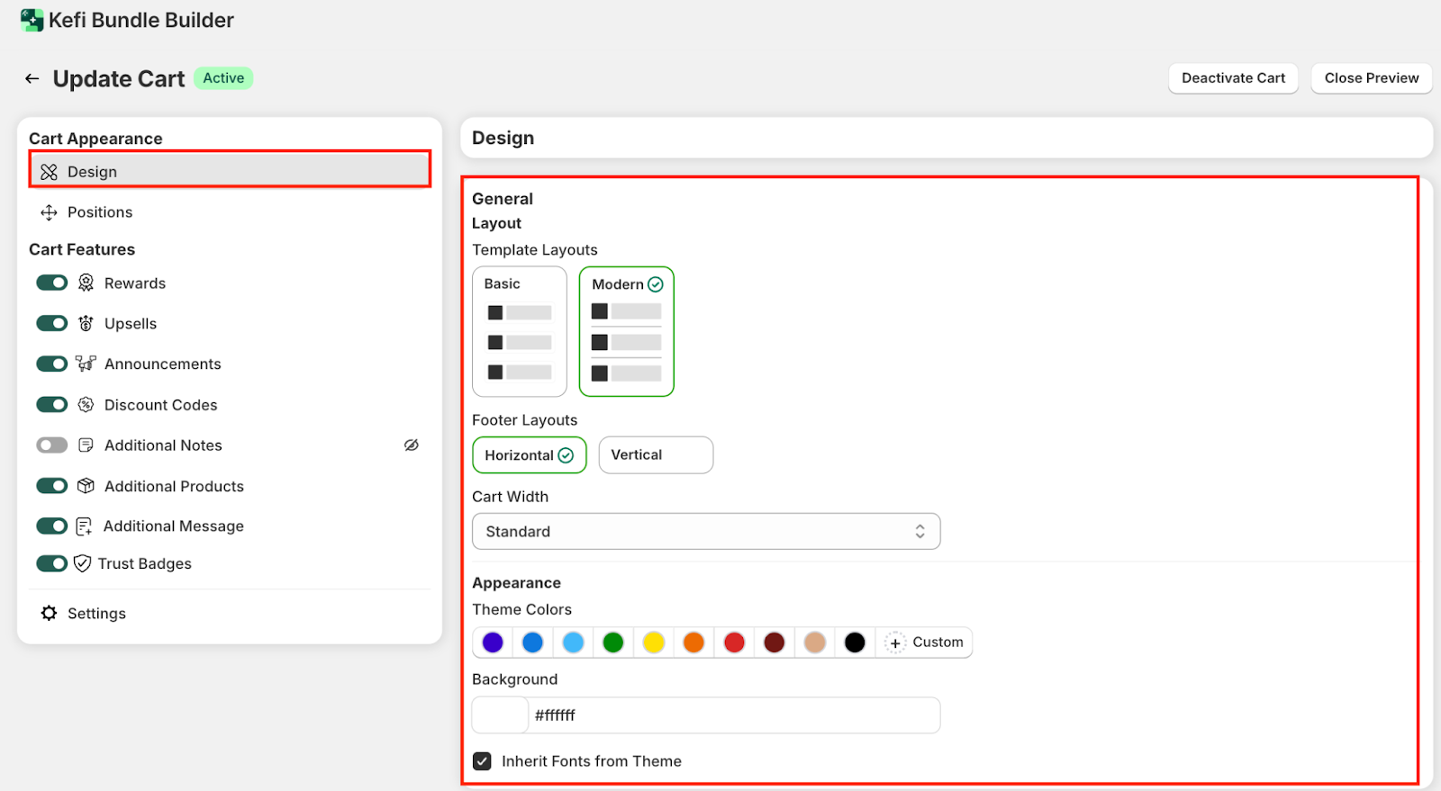
E. Background - You can also set a custom Background Color for the cart to further match your storefront.
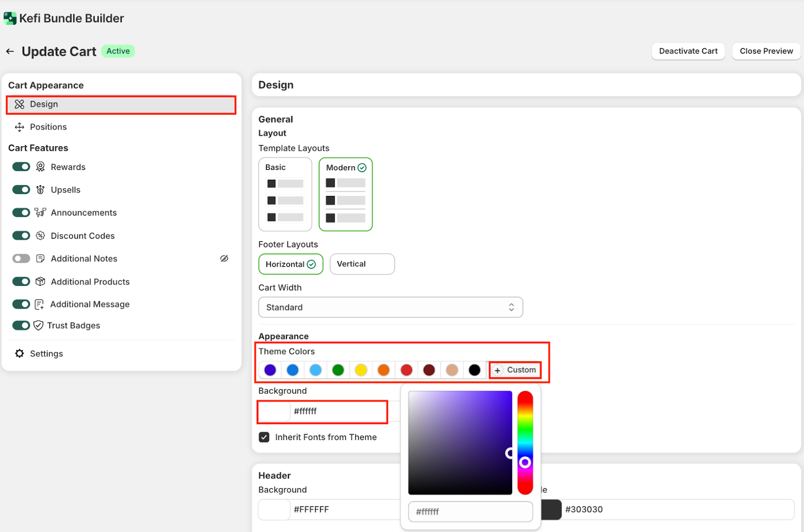
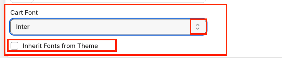
F. Inherent Fonts Theme - Enable or disable “Inherit Fonts from Theme” to automatically apply your store’s font styles within the cart. If you disable it, you can choose the cart font by clicking the arrow.
2. Header - This section allows you to fine-tune the appearance of your cart header, making it visually aligned with your brand.
A. Header Background & Title - Choose a background color for the header area, and customize the font color for your cart’s main heading.
B. Title Underline - Choose between a Solid underline or a Gradient effect under the title text. Select custom colors for both the Title Underline and Gradient End Color. Or, use the Gradient Direction slider to adjust the angle of the gradient effect visually.
C. Quantity & Close Button - Customize the color of the item quantity counter and the cart close button for visual clarity.
D. Height - Adjust the overall header height using dropdown options: Small, Medium, or Large—depending on how prominent you want the cart header to appear.

3. Product Card Color - The Product Card Color section lets you customize the look of your product cards in the slide cart. You can set specific colors for background, text, save text, quantity, discount text and background to align with your store’s branding.
4. Product Cart Typography - The Product Card Typography section lets you control the font size and style for different elements on each product card—such as title, product price, product properties, compare-at-price, and product save text. You can fine-tune the appearance to match your brand’s tone and improve readability throughout the cart.

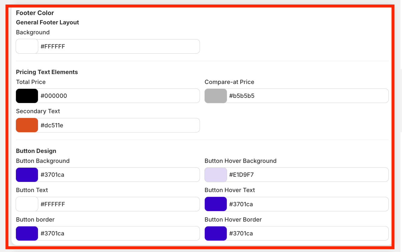
5. Footer Color - This section lets you customize how your store’s footer, pricing, and buttons appear. Adjusting these options helps create a consistent look and feel across your storefront.
Footer - Set the footer background to match your overall theme. A neutral background works best to keep focus on your content while maintaining a clean finish at the bottom of your store.
Pricing Text
Buttons
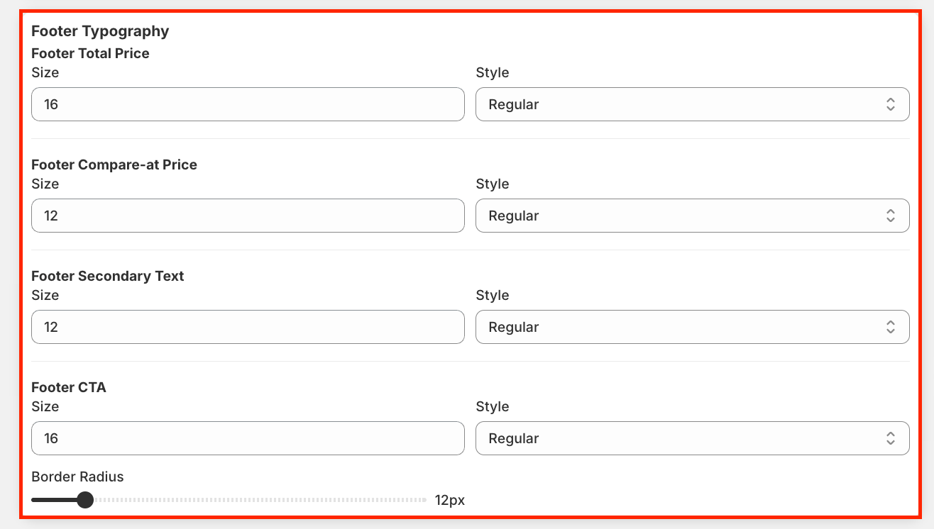
6. Footer Typography - This section allows you to adjust the text styling in your footer:
Click ‘Save’ to move on to the next section.
Adjust the Cart Position -
In the Positions section of Kefi’s Slide Cart, you can easily customize the placement of key cart features to optimize visibility and engagement.

Configure the Cart Features
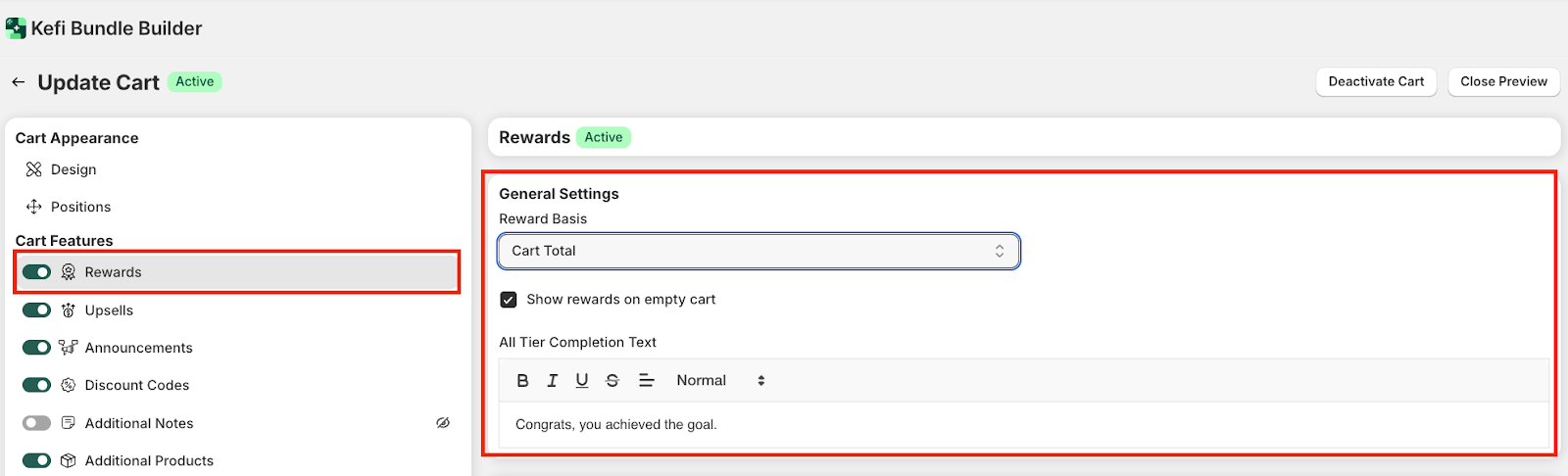
A. Rewards - Set milestone-based perks like free shipping, discounts, or free gifts to boost cart value as customers reach spend thresholds.

General Settings - This section defines how rewards work and appear in the cart.
Tip: Use “Deactivate” to pause rewards anytime without deleting them.
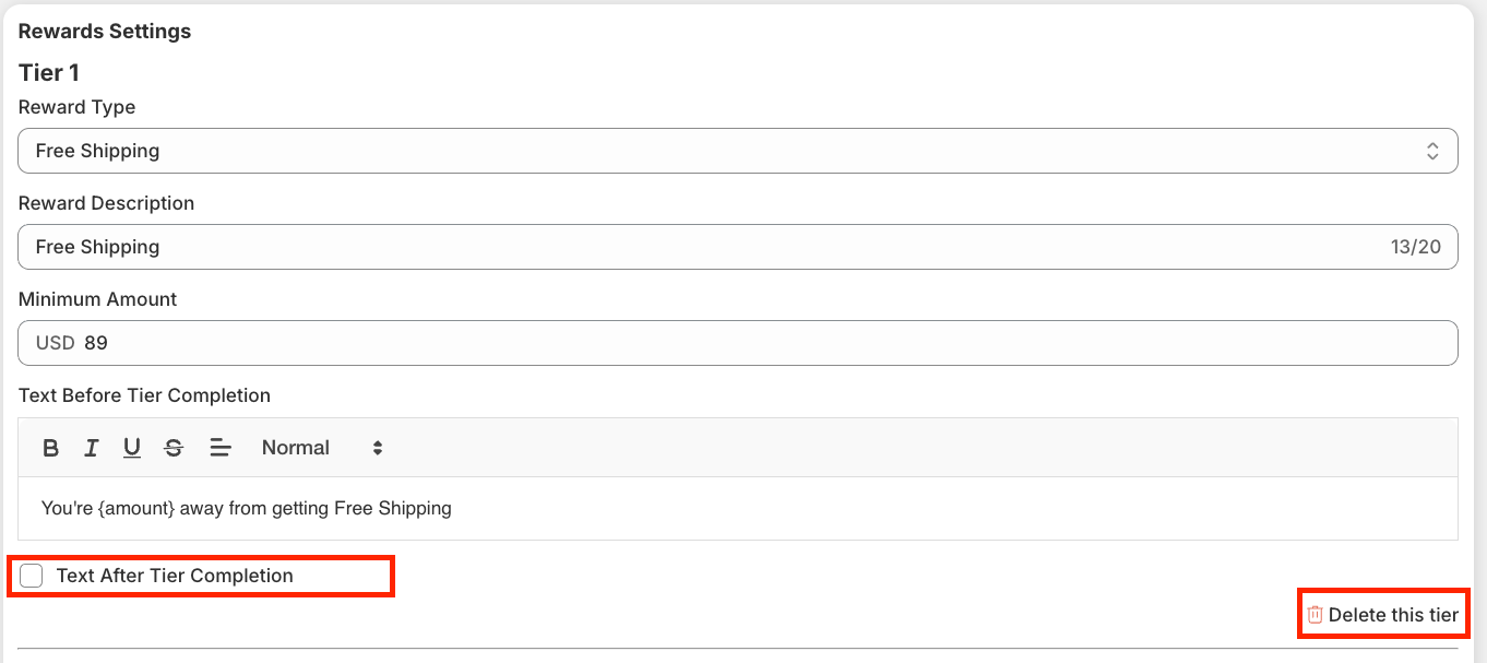
Reward Settings - This section allows you to configure tiered rewards that encourage customers to increase their cart value in order to unlock exclusive benefits like discounts or free shipping.

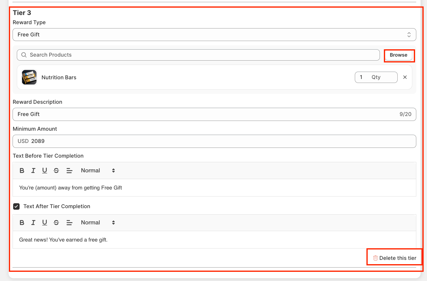
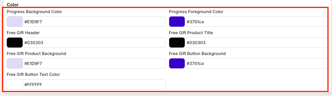
Advanced Settings - Advanced Settings let you control how rewards and free gifts behave in the cart for a smoother, more motivating shopping experience.
Checking the box activates the feature (e.g., rewards show on empty carts or free gifts are auto-added). While unchecking the box disables the feature, keeping the cart simpler and requiring customers to take action manually.

B. Upsells - The Upsells section lets you show targeted product suggestions in the Slide Cart, boosting average order value by encouraging shoppers to add more before checkout.
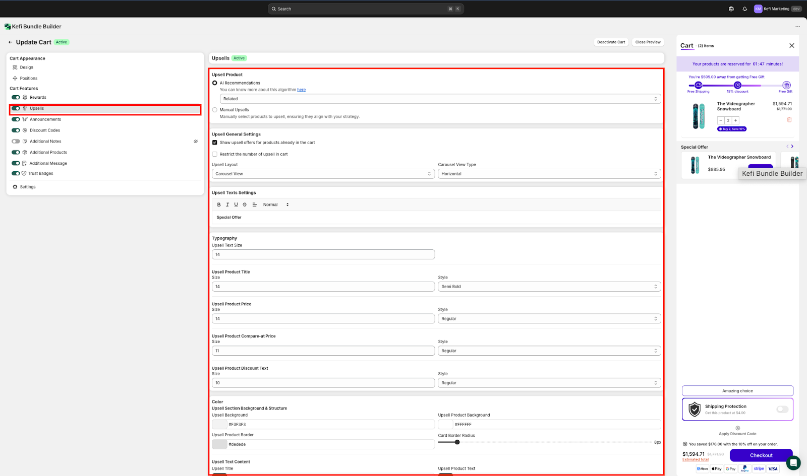
1. Upsell Product - Choose between:
AI Recommendations – Automatically suggest products based on customer behavior. Choose between Related or Complimentary.

Manual Upsells – Select specific products aligned with your sales strategy to upsell.
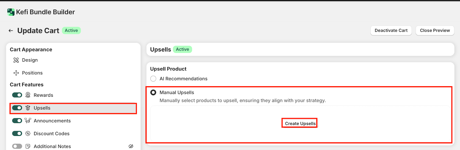
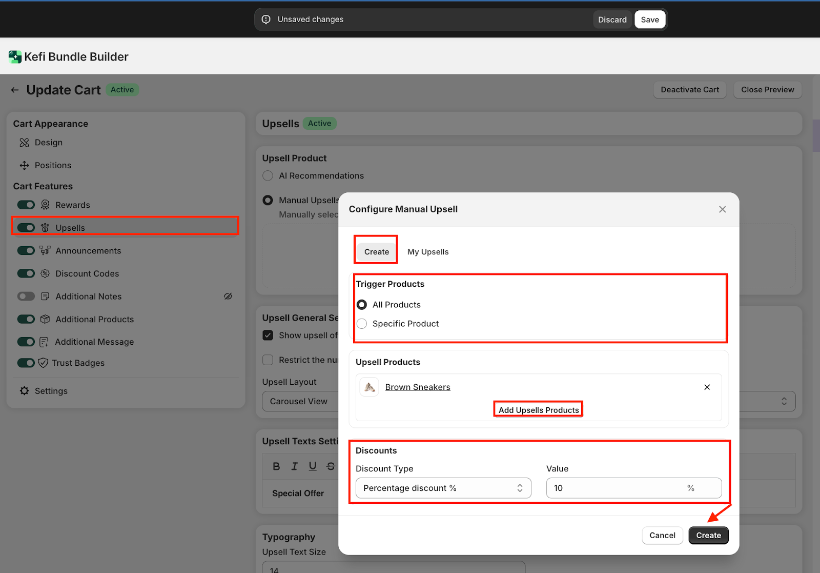
Click on ‘Create Upsells’ to build a custom upsell offer tailored to your strategy.
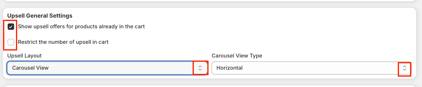
2. Upsell General Settings - This section lets you control how and when upsell offers appear in your Slide Cart.
3. Upsell Text Settings - This section lets you customize and style the header text above your upsell offers using rich text options like bold, italic, underline and more. You can use phrases like "Special Offer" to grab attention and boost engagement.

4. Typography - The Typography section under Upsells allows you to control the font size and style for all upsell elements—like product titles, prices, compared prices, and discount text. You can fine-tune the visual hierarchy and ensure consistency with your store’s design.

5. Colors - The Color section under Upsells lets you customize the color scheme for all upsell components—including product cards, text, buttons, and hover states. You can also control button border radius for a sharper or more rounded look that fits your brand’s style.
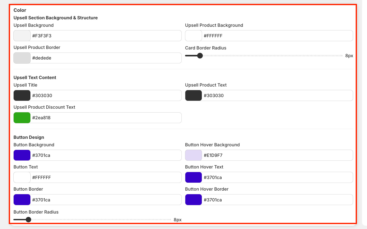
Once done with this section, click ‘Save’ to save the changes before proceeding with the next.
C. Announcements - The Announcements feature lets you display a countdown message in the Slide Cart, helping create urgency and boost conversions.
Click Deactivate Cart to remove the banner from your cart.

1. General - Set your announcement message and use {timer} to show a live countdown (e.g., “Reserved for {timer} minutes!”). You can also define the timer duration and choose the container size for visibility.

2. Colors - Use color settings to style your announcement banner’s background, timer, and message color—keeping it aligned with your brand’s look.

3. Typography - Customize the font size and style of your announcement message and timer to match your store’s tone and design.

STEP 8
D. Discount Codes - The Discount section lets customers apply promo codes directly in the Slide Cart. It helps boost conversions by making discounts visible and easy to use, with customizable text and styling to match your brand.
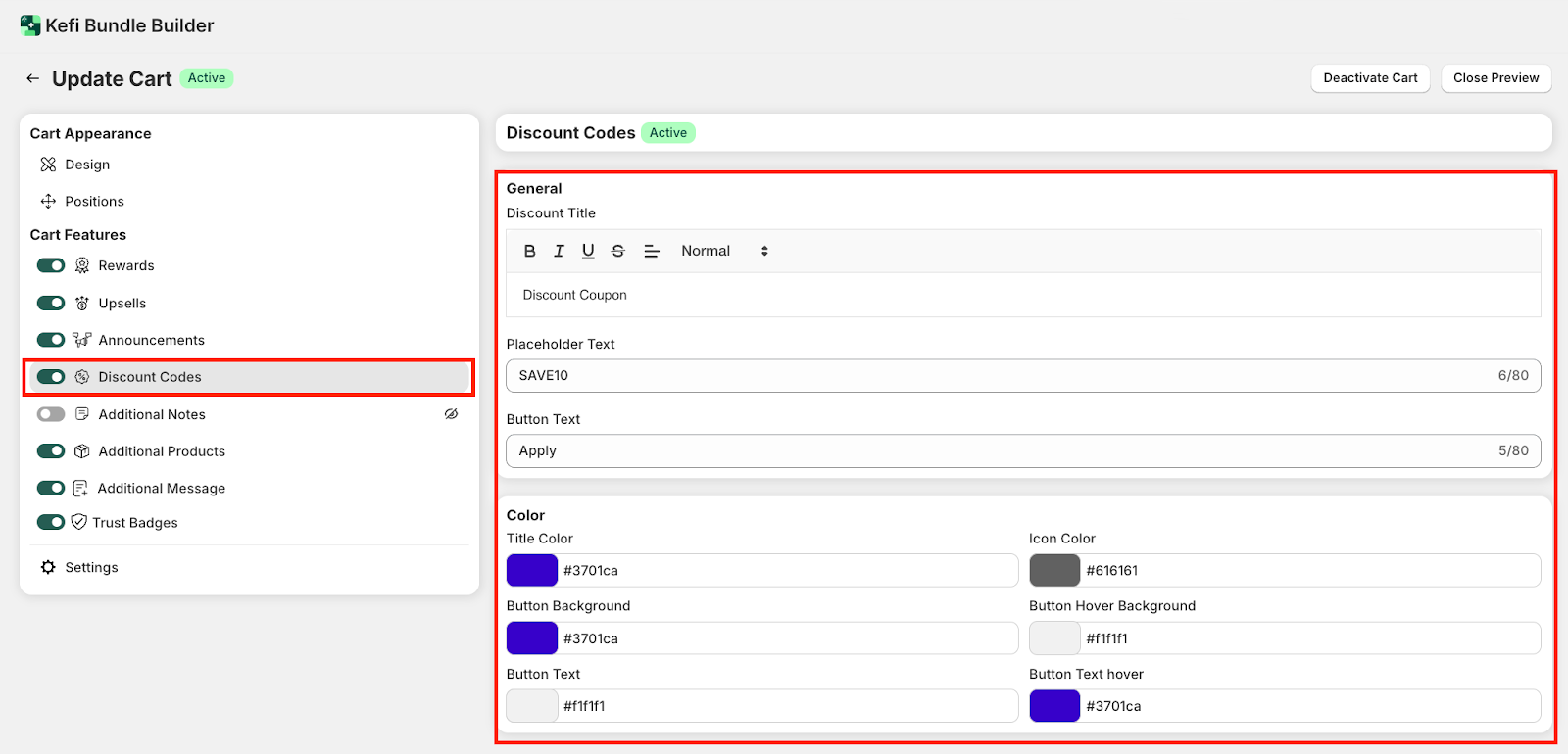
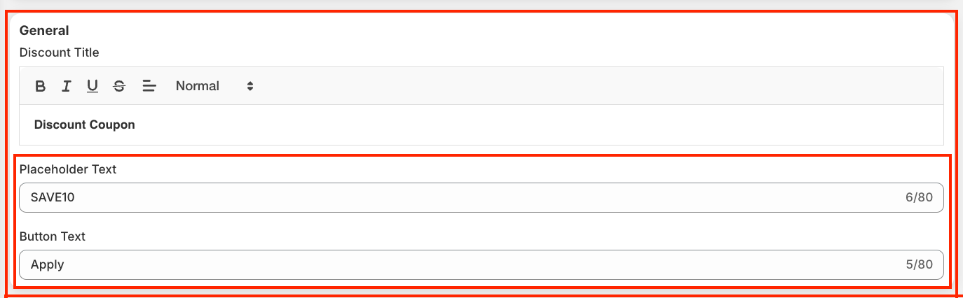
1. General - Set a custom Discount Title, add placeholder text to suggest a sample code (e.g., SAVE10), and define the button text (e.g., Apply) for the coupon field in your cart.
2. Color - Personalize title, icon, and button colors (background, text, and hover) to match your brand.

Once done with this section, click ‘Save’.
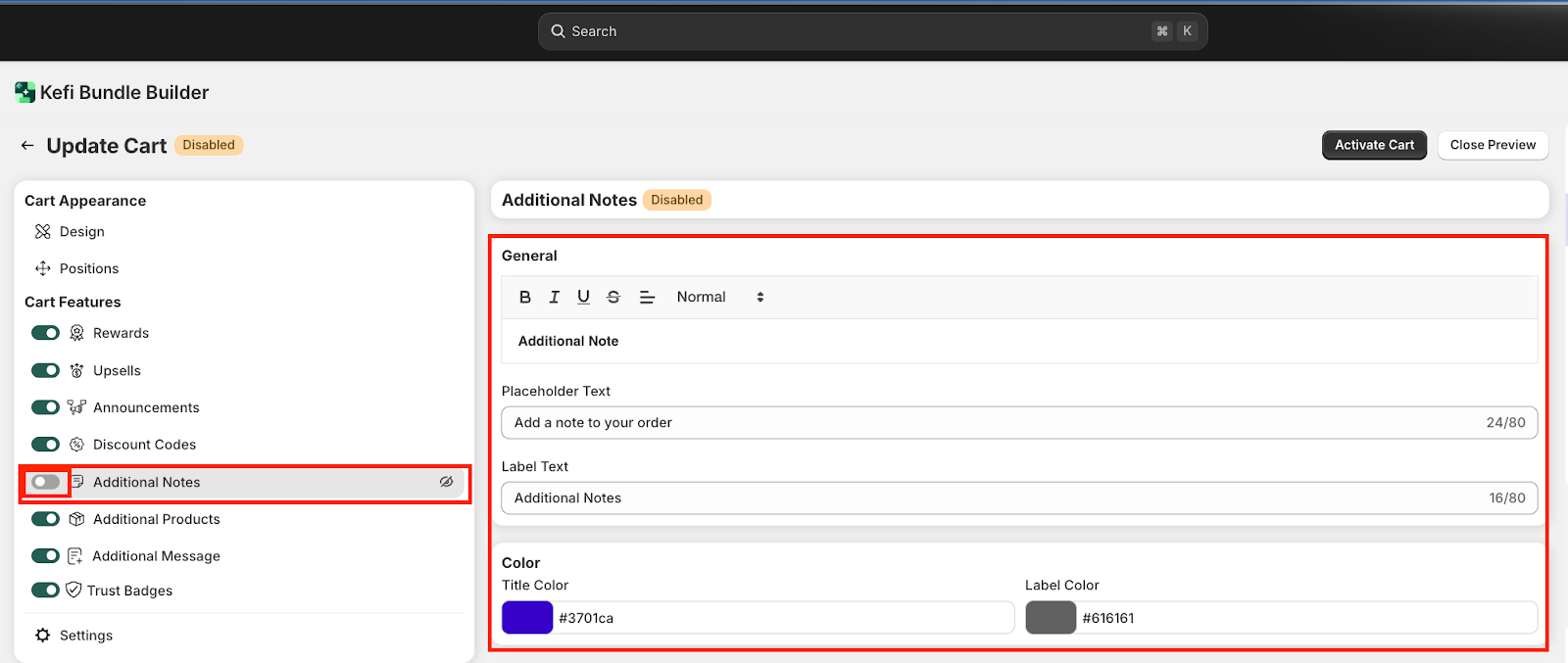
E. Additional Notes - The Additional Notes section lets customers leave special instructions with their order (e.g., “Gift wrap this item”). You can customize the note label, placeholder, and button text, along with colors to match your cart’s design.
Click Activate (top right) to enable the feature in your Slide Cart, and Save to apply all changes once you’re done customizing.
F. Additional Products - The Additional Products section lets you add small upsell items, such as Shipping Protection or Gift Wrapping, directly within the Slide Cart.

Once activated, the product appears at the bottom of the Slide Cart, giving shoppers a simple, low-effort way to add extra value to their order.
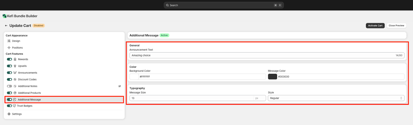
G. Additional Message - The Additional Message section allows you to display a custom note in the Slide Cart (e.g., “Amazing choice” or “You’ve unlocked a great deal”).
Click Activate to enable the message, and Save to apply the changes once the styling is done.
H. Trust Badges - The Trust Badges feature in Kefi allows you to display secure payment and brand logos—like Visa, PayPal, Apple Pay, and more—inside your cart. These badges help build credibility and increase shopper confidence by visually reinforcing that transactions are secure and trusted. You can also upload custom badges and control their size using the slider.

I. Settings - The Settings section in Kefi Slide Cart lets you control how your cart functions and appears across your store.
Deactivate Cart: Temporarily disables the Kefi Slide Cart on your storefront. This is useful if you want to pause its functionality without deleting your configurations. You can reactivate it anytime.
Close Preview: Exits the live preview mode and returns you to the main app dashboard. It does not affect any settings or visibility on your store.

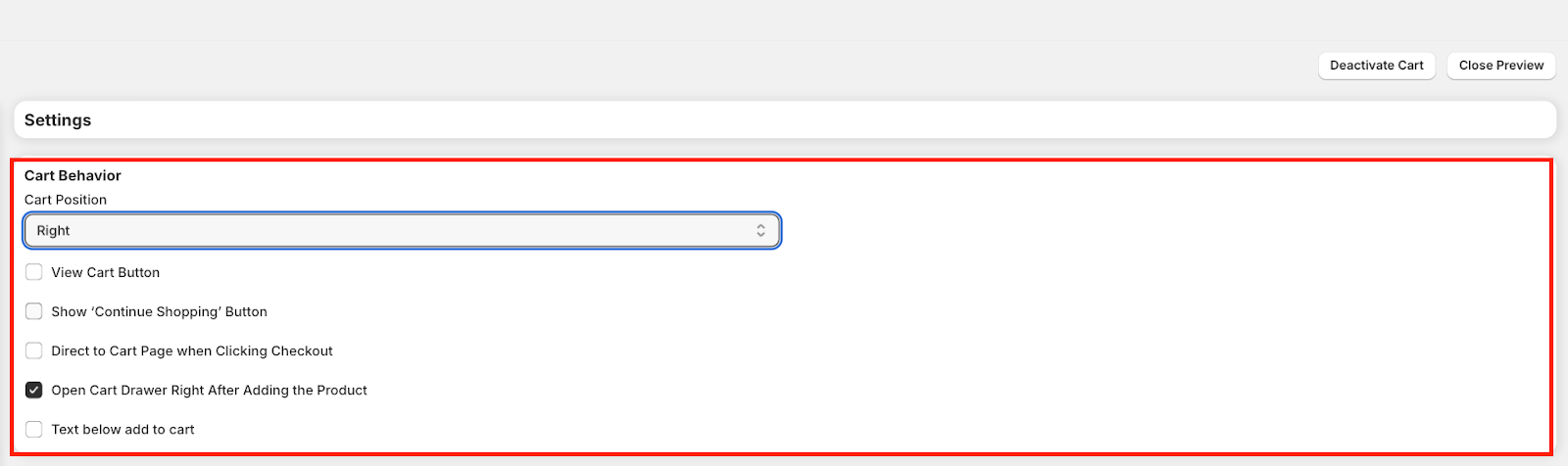
1. Cart Behavior
2. Product & Pricing Display

3. Texts and Labels
This section lets you customize the wording shown in your cart and checkout interface.
Cart Interface -
Empty Cart -
Discounts & Savings -

4. Upsells -
Add Upsell Text – Customize the label shown on the button when customers add an upsell product.

5. Free Gift - This product card appears when the customer qualifies for a free gift through rewards.
Free Gift Product Card – Customize the message shown on the card promoting a free gift.
You can use engaging text to encourage customers to claim their free item (e.g., “Grab your free gift!”)

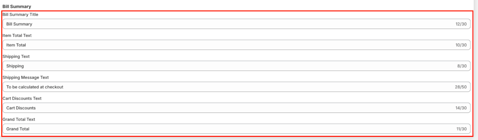
6. Bill Summary - This section controls the labels shown in the order summary area of the cart or checkout.
7. Discount Combination - The Discount Combination settings let you control whether different types of discounts can be applied together in the cart. This ensures flexibility in your promotions while preventing conflicts between offers.
Upsell Discounts - Decide if discounts applied to upsell products can also work with:
Order Discounts – e.g., percentage off the total order.
Product Discounts – e.g., discounts applied to specific products.
Shipping Discounts – e.g., free or reduced shipping rates.
Rewards Discounts - You can set how rewards stack with other discounts:

8. Additional - The Additional setting allows you to toggle the underline beneath cart text for visual separation. Enabling it can enhance readability and add a subtle design element to your cart layout.

9. Custom HTML - This option lets you add custom HTML code inside the cart.
Custom HTML Position – Choose where the content should appear (e.g., below the checkout button).
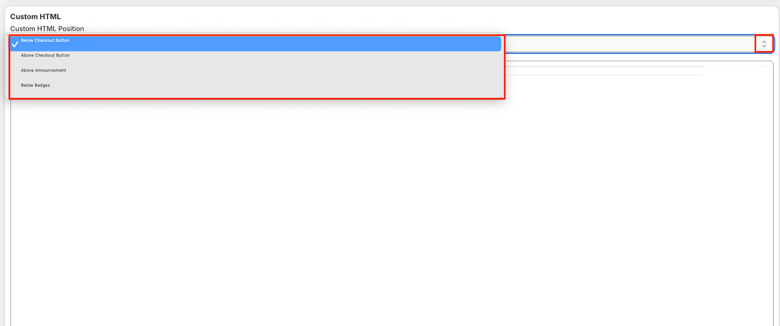
HTML Field – Enter your custom code.
This is useful for adding extra content or functionality without modifying the core theme.

The Save button applies all the changes you’ve made to your cart configuration. If you see the "Unsaved changes" message, it means updates haven’t been finalized yet. Click Save to ensure your edits are live and reflected in the customer-facing cart experience.

.svg)
