The Variant selector settings allow you to customize how customers choose between different product options—such as size, color, or material—directly within the bundle interface. Providing a clear and visual way to select variants improves the user experience and helps customers build their perfect bundle faster.
Go to Content tab → Variant selector section inside the Bundle Builder.
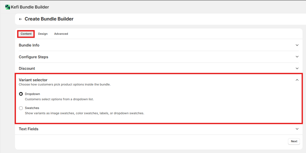
This controls the overall interaction pattern customers use to choose a variant (size, color, material, etc.) on each product card in the bundle.
Default: Dropdown is the default selector type.
Customers click a field to open a list of available variants and select one. No additional configuration required.
When to use: Use dropdown when products have many variants, when variant names are long, or when the distinction between options is best communicated in text (e.g., "Lavender & Chamomile" vs. "Eucalyptus Mint"). Also the safest fallback if you haven't configured swatches yet.
Default: Off — swatches are not active until you select this option and complete the setup.
Customers select variants by clicking a visual element — a color circle, an image thumbnail, or a text label button — instead of a dropdown menu.
When to use: Use swatches when the visual difference between variants is part of the buying decision (colors, prints, materials, shades). Swatches reduce clicks and make variant selection faster, especially on mobile. Not ideal for products with many variants (6+) where a dropdown is more scannable, or when variant names are too long to fit a label.
To activate: select Swatches as your selector type, then click Set up swatches to configure the appearance.
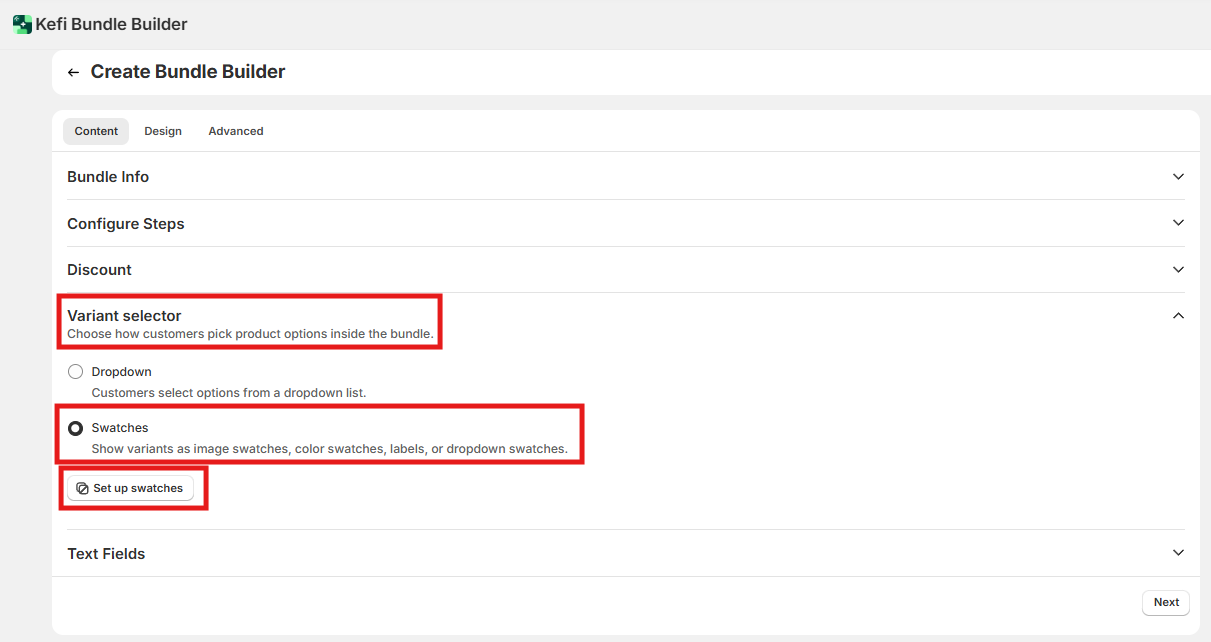
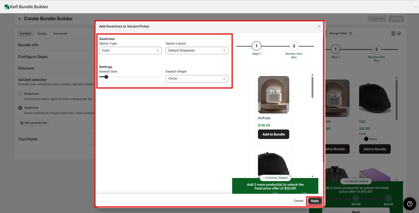
This section appears in the swatches setup modal after you click Set up swatches.
Specifies which product attribute you're configuring the swatch for — for example, Color, Size, or Title.
Set this to match the variant option name as it appears in your Shopify product. If your product has multiple option types (e.g., Color and Size), you configure each one separately.
Defines how the swatches for this option type are displayed. Options:
Default dropdown — a standard list, identical to the top-level dropdown selector. Use this as a fallback if you want swatches on one option type but a plain dropdown on another.
Color swatch — solid color circles or squares. Use this for color variants. You'll need to ensure variant colors are mapped correctly in your product setup.
Image swatch — small product image thumbnails. Use this for print, pattern, or material variants where a photo communicates the difference better than a color. Requires product images to be set per variant in Shopify.
Color dropdown / Image dropdown — a dropdown menu that includes a color or image preview alongside the variant name. Use these when you have many variants and want the scanability of a dropdown with a visual cue. Good middle ground for products with 6+ color or image variants.
Label swatch — clickable text buttons. Use this for size options (S, M, L, XL) or any short text option where you want a button-style selector instead of a dropdown.
These settings control the appearance of swatches on product cards.
Default: Unknown — check the slider default position in your app. (Verify: confirm the default swatch size value.)
Drag the slider to increase or decrease how large the swatches appear on the product card.
When to adjust: Increase size if swatches are hard to tap on mobile. Decrease if the product card feels cluttered, especially when a product has many variants displayed at once.
Default: Unknown. (Verify: confirm which shape is selected by default.)
Choose from three shapes:
When to adjust: Match the swatch shape to your store's overall design language. Shape doesn't affect function, only appearance.
Scenario: You sell a "Mix & Match" activewear bundle. Each product has two variant options: Color and Size. You want color shown as clickable swatches and size shown as label buttons.
Settings to configure:
Result: On each product card, customers see color circles to pick their color, and S/M/L/XL text buttons to pick their size — without opening any dropdowns. Both options are visible and tappable in one view.
.svg)
